Logo remake
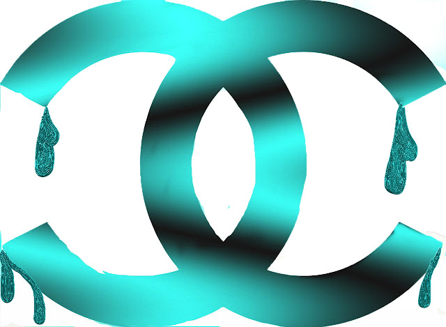
For this project I chose the Chanel logo because right when I saw it I had an idea on how to change it. I remade this to appeal more to the younger demographic by adding color, they would still have to be on the richer side, but still. Also the new colors are eye catching as well as the metallic drips look really cool especially if they were 3D on packaging.


Comments
Post a Comment